So now that we've got a pretty good idea of what a customer journey is, let's take a look at some customer journey maps.
Customer journey maps come in a variety of formats. The first thing you'll notice is that most of them don't really look like maps.
Generally, they're more like graphs or timelines. And I say it's more like a timeline because while the elements going up and down the Y axis here vary wildly, the X axis going across? It's almost always time.
The timeline may be divided into different stages or phases, but they're usually arranged in chronological order. Regardless, we'll stick with "map" because that's the industry term.
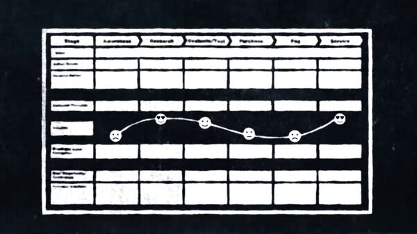
So let's start with a fairly simple map following someone selecting a blood glucose monitoring system.
Our persona is Heather, a type two diabetic in her thirties who is choosing buying, and then using, such a system.
On the Y axis of this map, we have customer satisfaction or happiness. On the X axis, time.
So the thing that looks like a mountain range here is a representation of Heather's satisfaction levels over time. These circles across the bottom of the map are the thoughts and questions that occur to her along the way.
There are things like, "It's convenient, but I wonder, is it as accurate as my old system?" or "Is this sensor really waterproof?"
The great strength of this design is that it illuminates the mindset of our customer so well. At every step of her journey, we have a pretty good idea of what Heather is thinking and feeling.
So this is an effective design for a high-involvement purchase where strong emotions are at play, which is often the case with customers who are also patients.
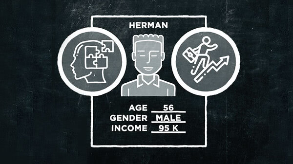
Okay. Here's another more complex map. It follows several dermatologists, all of whom are trying to decide which type of laser to buy for their medical practices.
Along the top here, they've divided the timeline into stages. It's a very common arrangement. The particular stages they've chosen are awareness, consideration, purchase, experience and advocacy.
Just below the stages or steps are what are called Customer Touchpoints. A touchpoint is any place along the journey where a customer has some sort of contact with your brand.
Generally speaking, this could be in anything from reading a blog, to talking to a store associate, to observing someone in the wild using one of your products.
Obviously, few of those are going to appear in this particular example, but you get the idea.
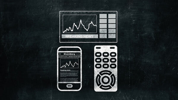
The Y axis on this map has been divided into various marketing or communication channels, like a TV commercial, a billboard, email from a colleague or social media. Again, not all of these are relevant to this special case.
The colored lines are customer journeys. Specifically, each line represents the path taken by a different persona, or physician, in this map.
These blips or dots represent customer touchpoints. One of the reasons this map is so complex is that it follows four personas at once. But if we follow just one persona's customer journey, it might look like this.
In the awareness phase, our doctor is familiar with her patient's needs, knows several brand names of lasers through manufacturer's reps who have contacted her over the years, and is also bothered by the shortcomings of her existing laser.
In the research phase, she visits the websites and online catalogs of competing brands.
She also queries a colleague who uses one of the brands she's considering with an email.
She also attends an industry trade show where she can actually compare the models in real life.
This is where she makes a final decision and places her order with her rep.
Later, after using her new laser on a number of patients, she enters the advocacy phase of her journey. She does discover some limitations with the new device, but overall, she is pleased with her choice. So that's an example of a pretty complex and specialized journey map.
The real question is, is the design of the map well suited to a costly and specialized purchase like this?
The biggest problem with this map is that it follows too many customers. Visually, it's a bit overwhelming. We recommend just one customer per map.
Now let's go to a simpler example. This one follows a customer looking to purchase a new pair of glasses. We'll call him Elton.
This one is more like a grid or matrix. As you can see, the timeline has been divided into just three broad stages, awareness, consideration, and decision.
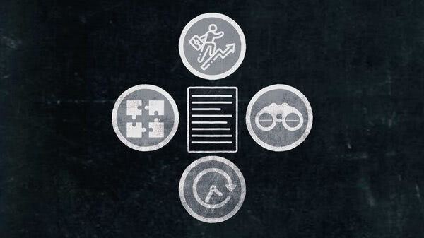
In this column down the left-hand side are a number of parameters. On the top, we have "what is the customer feeling or thinking?" Below that, "what is the customer doing?" Below that is "what is the customer researching or asking?" And the last one in the column is "how can we move this customer towards choosing us?"
This customer journey map doesn't really have specific touchpoints. But it does offer insights into what Elton is thinking, feeling and considering at different stages of his journey.
So how suited is this format to buying a pair of eye glasses? I would say it's pretty good. With a purchase like eye glasses, so many of the decisions to be made are personal and internalized. And many of them will also be made in a single visit to a store or website. You could say that there is one dominant, very concentrated touchpoint.
A simple matrix format like this also allows for expansion on that touchpoint through plenty of text wherever it is required.
So those are just three random styles of customer journey maps out of the plethora available to you.
Try Googling "customer journey map", and you'll see what I mean. They're all over the place. So what format do we recommend as a template for your customer journey map?
In the resource section below, you'll find a link for a template that we like to use.
The exact format you decide on depends largely on the question you're trying to answer or the problem you're trying to solve.
Looking to improve retention of website visitors? Then a customer journey map that graphs satisfaction and highlights plenty of pain points it's probably your best bet.
Is your goal to raise awareness of your brand and recruit new customers?
Then a matrix-style map, concentrating on the early stages of the customer journey with lots of different channels or media on the vertical axis might be a better format for you.
By the way, while it's fine to have an area of concentration in your customer journey, don't omit any phase entirely.
Sometimes an observation made at one stage of the journey can offer surprising insights into another.
All right, now that you have some idea of the range of map styles available to you, let's take a closer look at one legendary customer journey and what the map for it might look like.