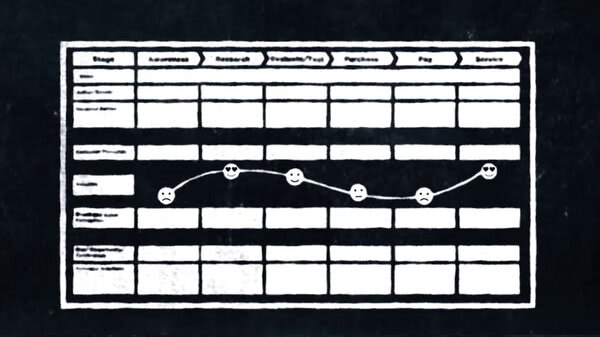
So what have we learned in this video series about designing a website when it comes to the mobile user?
The first thing, and I keep repeating this point, is that we absolutely must consider designing for the mobile user.
For the simple reason that there are more people visiting websites from mobile devices than any other kind. And it's not just people choosing to do less and less of their browsing from a desktop or laptop. In markets like Africa, South America, and much of Asia, the smartphone is many users' only access to the internet. There is no desktop computer waiting for them at home.
Two. When building a mobile-responsive website, design for mobile first, then for larger screens. Adding elements to a core design is just less painful than whittling away at a more elaborate one. If your software allows you to design for multiple screens side by side, even better.
Three. When designing for users on the go, keep the number of steps between them and their goals to a minimum. A good rule of thumb is, the smaller the screen, the fewer the taps you want users to have to make. While this applies to all user experience design, it is even more critical for small screens.
Four. Although you can never really ignore mobile users, there are times when you don't want to design primarily for them.
For example, when a strong visual or emotional impression comes first or the desired conversion is a high-involvement purchase.
Five. Sure, it's important to think of screen size. But better to begin by asking how urgent is your visitor's need? Then ask yourself what kind of device they're most likely using. Proceed from there.
Finally, I'll leave you with one more way to put mobile users into context: The mobile visitor is generally interested in shorter interactions--finding an address, dipping into Twitter or Facebook, checking to see if that email arrived.
For the desktop/laptop visitor, the quality of their web experience is more important. They expect something richer and probably more prolonged.
And the tablet? While used in several enterprise contexts, it is still primarily used for leisure.
Good luck with your project and if you're struggling a bit with this one, keep in mind that old saying: "You can please some of the people some of the time." In other words, design always involves some compromise.
Deciding when to make those compromises? That's the real art of designing for mobile.