Designing for Mobile

6 Videos
status pause Introduction 01:48 status pause Screen Size and Responsive Design 01:33 status pause The Smaller Screen - Optics and Layout 02:04 status pause The Customer on the Move 03:00 status pause The Bigger Picture 02:06 status pause Conclusions 02:24
previous Select Series

Designing for Mobile Part 3: The Smaller Screen - Optics and Layout

27 views • May 01, 2020

Designing for Mobile
Part 3: The Smaller Screen - Optics and Layout


icon
All about designing for the small screen, including tips on zooming, scrolling and minimum font sizes.

Now that we know what responsive design is, let's look at some design features that are important for a good user experience.

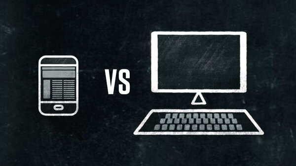
In previous videos, we discussed how small screens on mobile devices most often require some scrolling to view everything that would be visible on a big screen. This is because the page elements on a responsive mobile site usually get stacked on top of each other as the page layout responds to the smaller real estate.

User studies have shown quite clearly that people are comfortable scrolling vertically. Horizontal scrolling, not so much. This is probably because it's more difficult to scroll sideways using one hand.

Also, you want to avoid having users pinch and zoom to see content. It's not a disaster, but if people can read everything through tapping and scrolling, so much the better. Make sure your minimum font size is legible.

The copy on your website should feel as comfortable as reading a well-designed book held in a normal reading distance. For this, you want to consider 16-point text or even larger.

16 points is what Google recommends in their material design standards and is the default size for modern browsers. Select a font that scales well.

Some headline fonts are hard to read at smaller sizes. Okay, I know I said avoid zooming, but product images on small screens have to be expandable. Tapping or clicking is the preferred method.

Speaking of tapping, keep in mind that the contact area for a fingertip is about three quarters the size of a dime. So make sure that interactive elements are at least half an inch apart.

And lastly, remember that tapping the screen on a mobile device is the same as clicking your mouse. There is no option to reveal hidden information using cursor movements or pointing, like you can on a desktop.

All right, those are some insights for making sure that your elements of your website work on mobile devices. These considerations are key to good user experience design.

In our next video, we're going to get back to your particular users. Where they are when they visit your site and what they want at that moment.

Transcript Now that we know what responsive design is, let's look at some design features that are important for a good user experience.
In previous videos,
we discussed how small screens on mobile devices most often require some scrolling to view everything that would be visible on a big screen. This is because the page elements on a responsive mobile site usually get stacked on top of each other as the page layout responds to the smaller real estate.
User studies have shown quite clearly that people are comfortable scrolling vertically. Horizontal scrolling, not so much. This is probably because it's more difficult to scroll sideways using one hand.
Also, you want to avoid having users pinch and zoom to see content. It's not a disaster, but if people can read everything through tapping and scrolling, so much the better. Make sure your minimum font size is legible.
The copy on your website should feel as comfortable as reading a well-designed book held in a normal reading distance. For this, you want to consider 16-point text or even larger.
16 points is what Google recommends in their material design standards and is the default size for modern browsers. Select a font that scales well.
Some headline fonts are hard to read at smaller sizes. Okay, I know I said avoid zooming, but product images on small screens have to be expandable. Tapping or clicking is the preferred method.
Speaking of tapping,
keep in mind that the contact area for a fingertip is about three quarters the size of a dime. So make sure that interactive elements are at least half an inch apart.
And lastly, remember that tapping the screen on a mobile device is the same as clicking your mouse. There is no option to reveal hidden information using cursor movements or pointing, like you can on a desktop.
All right,
those are some insights for making sure that your elements of your website work on mobile devices. These considerations are key to good user experience design.
In our next video, we're going to get back to your particular users. Where they are when they visit your site and what they want at that moment.
OR
OR

Other videos you may like

Want to get Started?

Tell us about your project
Contact Us