


 Select Series
So I hope that with this series I've impressed upon you the importance of designing your website for mobile users. Obviously the main reason: More and more people are accessing their websites using their phones.
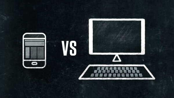
There's a caveat here: Not every user is looking for a small-screen experience. So when should you design for that big screen desktop or notebook visitor, even if it means some compromise for the smartphone user?
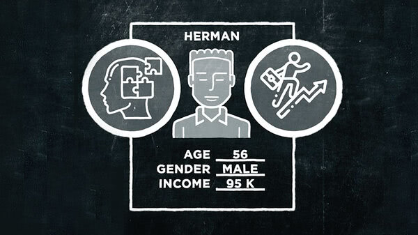
Suppose you're an architectural firm and the purpose of your website is to land new clients. You want to dazzle the people who can hire you, but they're not making a snap decision the way that someone's shopping for a blender or a plumber is.
They're probably looking at your site from their office computer and going to take a considerable amount of time to make up their minds. Does it matter if it takes them three clicks instead of two to get to your phone number? Probably not.
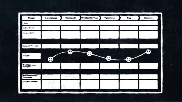
Let's say your company is in the field of medical technology and you manufacture MRI machines--- a highly competitive business. These machines cost millions. Deciding which make and model to buy may take a customer months. In this case, it would be important to provide comprehensive information about your products' benefits. And the support that you provide all along the customer journey.
Your clients will be concerned about the clinical efficiency gains, improvements in image quality, patient comfort, ways to support the diagnostic decision making, as well as cost and financing. All of this requires a lot of screen time on your website. Suddenly, finding the hours of operation of the sales team isn't so urgent. And who wants to spend hours squinting at a smartphone screen to make such an important decision?
So, for high-involvement purchases, how your site comes across on the big screen may take precedence. And if that fancy infographic or that beautiful high-rise product shot takes a few extra seconds to load, it's probably worth it. As always, it comes down to putting yourself in the users' shoes.
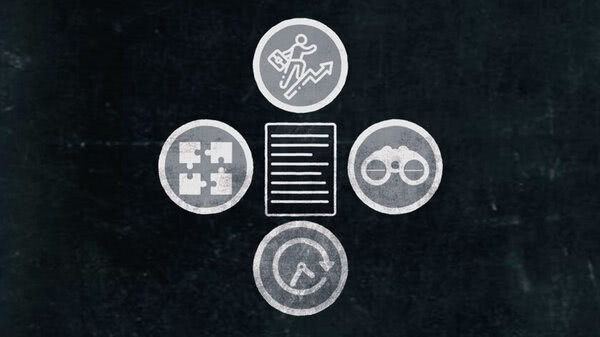
Who are they? Why are they visiting your site? What are they looking for? Don't get me wrong, you must always consider what your website looks like on a smaller screen.
Just know that sometimes it's going to have to take a backseat to the bigger picture.


